
Mobile UX Design Trends 2027: What Actually Matters (And What's Just Noise)
Search “mobile UX design trends 2027” and you’ll find the same fifteen items reshuffled across a dozen articles: dark mode, micro-interactions, bento grids, AI personalization, glassmorphism. Most of it was already true in 2023. None of it tells you where to put your next quarter’s design budget.
The trend that actually matters for mobile UX in 2027 isn’t visual. It’s structural. A growing share of tasks users used to complete by tapping through your app are now being handled by an assistant sitting on top of it, or by an agent acting on the user’s behalf without opening the app at all. Nielsen Norman Group’s 2026 research on the state of UX put it plainly: as AI-mediated interactions become more common, the screen matters less because people are talking to an agent instead of navigating pages.
Pedals Up is an AI-native product engineering company that builds web, mobile, SaaS, and AI products for startups and scale-ups across the US, UK, and UAE. We design and ship mobile products for a living, and the pattern we keep seeing is founders investing in visual polish while the actual interaction surface for their users quietly moves off-screen.
This isn’t an argument that visual design stops mattering. It’s an argument for sorting mobile UX trends into two piles: the ones that change how your app needs to be architected, and the ones that just change how it looks in a portfolio.
Why Most Mobile UX Trend Lists are Outdated the Day They Publish
A trend list built around visual style ages fast because style is cheap to copy. If a competitor ships glassmorphism or a bento grid layout, you can match it in a sprint. That’s not a competitive edge, it’s table stakes.
The trends worth tracking are the ones that are hard to copy because they require rethinking the underlying architecture, not just the component library. Two examples: making your app’s functions callable by an AI agent, and redesigning onboarding around the assumption that a user’s first interaction might not be a screen at all.
Mobile still carries the majority of digital traffic. Mobile devices, excluding tablets, accounted for just over half of all global website traffic in the first quarter of 2026, according to Statista. That volume is exactly why getting this distinction wrong is expensive. Budget spent on trend chasing at that scale is budget not spent on the architecture decisions that determine whether your app still works when half your users are interacting with it through a voice assistant or an AI agent instead of your interface.
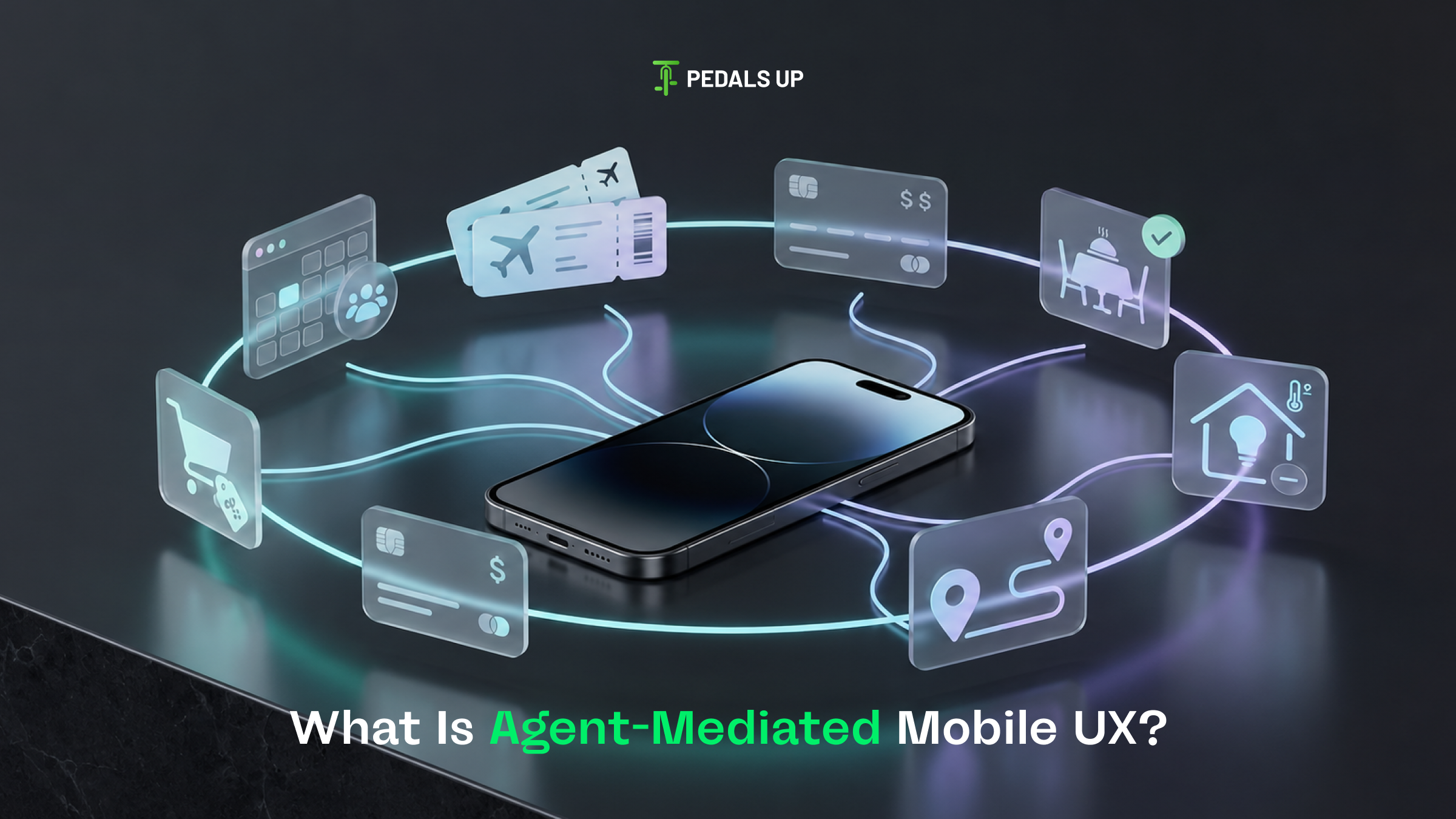
What is Agent-Mediated Mobile UX?
Agent-mediated UX describes interactions where an AI agent, not the user directly, navigates or triggers actions inside your app. Instead of a user opening your app to book a table, an assistant on their phone checks availability, applies their preferences, and completes the booking, sometimes without the user ever seeing your interface.
For product teams, this means your app’s value increasingly depends on whether its functions are exposed in a way an agent can use reliably, not just whether a human can tap through them.
How should a mobile product team prepare for agent-mediated interactions in 2027?
Teams should audit which core actions in their app (booking, checkout, account changes) could plausibly be triggered by an assistant on a user’s behalf, then check whether those actions are exposed through structured, documented interfaces rather than buried three taps deep in a menu. If the only way to complete an action is through a specific screen sequence, an agent can’t reliably do it for your user, and you lose that interaction to a competitor whose app is easier to act on.
The Trends Worth Your 2027 Budget
AI that reduces the interface instead of decorating it
The lazy version of “AI in mobile UX” is a chatbot bolted onto the corner of an app. The version that actually moves metrics removes steps: predictive form fills, one-tap reordering based on real usage patterns, notifications that resolve a task instead of just announcing it.
The distinction is whether the AI removes a screen or adds one. A banking app that uses AI to skip a manual budget-entry flow is doing real UX work. A banking app that adds an AI chat window explaining features the user could already see is adding friction dressed up as innovation.
Permission and data transparency as a design problem, not a legal one
Mobile users have been trained by years of app store prompts to distrust vague permission requests. In 2027, the apps that win trust are the ones that explain, in the interface itself, why a permission is being requested and what happens if the user declines it.
This matters more as apps request access on behalf of AI features. A generic “allow access to contacts” prompt reads very differently from one that explains the AI feature it powers and offers a fallback if the user says no. Teams that treat this as a design decision instead of a legal checkbox see fewer opt-out rates and less churn at onboarding.
Lighter, faster, more disposable entry points
App clips, instant experiences, and progressive web app patterns are pulling weight away from the traditional “download, onboard, retain” funnel. A user scanning a QR code at a restaurant table doesn’t want a 40MB install and a five-screen onboarding flow. They want the one function they came for, completed in under a minute.
This changes what “onboarding” even means for a growing share of mobile interactions. Instead of designing one onboarding flow for every new user, teams need a lightweight path for task-specific entry and a fuller one for users who convert into regular app users.
Foldables, wearables, and screens that aren’t rectangles
This one is genuinely visual, but it’s not cosmetic. Foldable phones and wearables break the assumption that your layout system only needs to handle one aspect ratio. Apps that hardcode fixed layouts break visibly on a folded screen or a watch face, and that breakage is public and screenshot-worthy in the worst way.
The fix isn’t a new design trend, it’s a return to responsive design discipline that a lot of mobile teams let slip once “mobile-first” became shorthand for “designed for one phone size.”
What's Overhyped For 2027
Glassmorphism, extreme minimalism as a blanket rule, and AR try-on features outside of very specific categories like furniture and eyewear. These get cited in nearly every trend list because they photograph well, not because they consistently move conversion or retention numbers. If a trend’s main evidence is that it looks good in a Dribbble shot, treat it as optional polish, not a roadmap priority.
Frequently asked questions
What is the biggest mobile UX trend for 2027?
The biggest shift is architectural, not visual: mobile apps increasingly need to support agent-mediated interactions, where an AI assistant completes tasks on a user’s behalf instead of the user tapping through screens directly. Visual trends like dark mode or micro-interactions still matter but have far less impact on retention or conversion than this structural shift.
Do mobile UX trends actually affect conversion rates?
Some do and some don’t. Trends that remove steps from a task, like predictive fills or lighter onboarding for one-off interactions, tend to affect conversion directly. Purely visual trends like glassmorphism or bento grid layouts rarely move conversion on their own and should be treated as polish rather than strategy.
How should a startup decide which mobile UX trends to invest in?
Start by asking whether a trend changes your app’s architecture or just its appearance. Architectural changes, like exposing core actions for AI agents or redesigning onboarding for instant, task-specific entry points, tend to have a longer shelf life and higher return than visual trends that competitors can copy within a sprint.
What is agentic UX in the context of mobile apps?
Agentic UX refers to designing mobile products so that an AI agent, not just a human user, can reliably trigger and complete actions inside the app. This requires exposing key functions through structured, documented interfaces instead of relying solely on a human tapping through a specific screen sequence.
The Takeaway
Trend lists feel productive because they give you a checklist. But a checklist of visual patterns doesn’t tell you anything about whether your app still works when the way people interact with software fundamentally shifts. The mobile products that hold up in 2027 won’t be the ones with the most trend boxes checked. They’ll be the ones built with the assumption that fewer of their users will ever look directly at a screen to get what they need.
If you’re deciding where to put your mobile UX budget for next year, it’s worth stress-testing your current app against that assumption before committing to another round of visual refresh. Pedals Up’s product engineering and UI/UX design work is built around exactly that kind of stress test, figuring out which parts of your product need to evolve structurally and which just need a fresh coat of paint.