Introduction
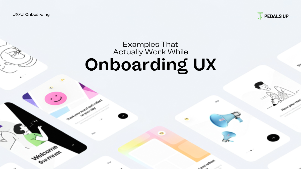
A clean UI can’t save a confusing onboarding. A nice-looking app can’t take the place of bad instructions. And there is no amount of animation that could repair an onboarding flow that was never designed for how real people learn.
In our previous breakdown of top companies with great onboarding UX, we talked about the design patterns behind intuitive flows used by teams like Duolingo, Calm, Tinder, Notion, and Slack.
If you haven’t had a chance to read it, here’s the link: https://pedalsup.com/designing-user-onboarding-lessons-from-top-companies-with-great-onboarding-ux/
This article extends that foundation by going deeper into what actually happens under the hood of great onboarding, not just what it looks like, but the decisions, tradeoffs, and psychology behind it.
Let’s dive deeper into what matters while designing onboarding UX with real examples of products that nailed it.
1. Clarity Beats Cleverness, Every Single Time
One question comes to the minds of all users: What does this app do for me?
Apps that mask value behind witty lines, overly creative copy, or gamified noise are losing users in a matter of seconds.
Example: Calendly
First screens show:
- What the product does
- Why it exists
- How you’ll use it in the next 30 seconds.
No mystery, no mental effort. It’s one of the many reasons Calendly went from niche tool to a scheduling default.
What to keep in mind:
- Your users aren’t reading, they’re skimming.
- State the value. Show the value. Reinforce the value.
- Save the personality for later. Clarity comes first.
2. Design One Decision at a Time to Reduce Cognitive Load
It achieves nothing when onboarding tries to achieve everything at once.
- Multi-step screens are not the devil.
- Multi-decision screens are.
Example: Notion
Notion famously distributes decisions over a lot of tiny steps:
- Pick a space $\rightarrow$ pick a theme $\rightarrow$ add a page $\rightarrow$ get one small win.
Each micro-step feels lightweight. Users don’t feel like they’re “onboarding” as they move forward.
What to keep in mind:
- Reduce variables per screen
- Pay attention to linear development, not to branching paths.
- Make actions reversible to reduce pressure
3. Personalization Works, But Only If It Drives Relevance
Personalization is yet another buzzword that’s thrown around. But most onboarding flows use empty personalization that doesn’t change anything meaningful downstream.
Example: Headspace
When Headspace asks about user goals, stress, focus, sleep, the app changes the recommended routines in real time. It’s the choices that make the real experience.
What to remember:
- If a question doesn’t change the outcome, cut it.
- Personalization should bear functional value, not decoration.
- Gather the fewest number of inputs that unlock relevance.
4. Show Progress; People Can't Abide a Sense of Being Lost
Because people are wired to continue what they’ve already started. That’s what we call the Zeigarnik effect. Indicators of onboarding progress aren’t decoration, they’re psychology.
Example: Duolingo
It keeps users focused through a gamified progress bar on “finishing the lesson” rather than the effort of the lesson.
What to keep in mind:
- Use progress bars for multi-step onboarding
- Avoid implicit steps or uncertain directions.
- Close loops of accomplishment quickly
5. Onboarding Should Create The First Win Fast
This specific period, where he feels the key value of the product, is termed an Aha Moment. Great onboarding isn’t about handholding; it’s about accelerating the Aha.
Example: Figma
Onboarding skips the theory, throwing you directly into the editor with guardrails that help you in designing something within a few minutes.
Issues to consider:
- Front-load the core action:
- Eliminate all that is delaying the first meaningful contact.
- Avoid tours that explain instead of doing.
6. The Smart Path is the Default Path
Good onboarding doesn’t ask the user what they want at each step. You decide upon what is best and guide them with a clear, recommended path.
Example: Spotify
When you install Spotify, the flow heavily pushes you toward the following:
- Importing preferences
- Favorite artists picking
- Auto-personalization of recommendations
That sets users up for success, pretty much without them trying.
Things to remember:
- Smart defaults lead to higher activation
- Reduce friction in the default path
- Allow only the users who need it to use “advanced setup”
7. Remove Optional Steps (or Make Them Truly Optional)
Worst onboarding crime? Forcing users to do steps irrelevant to the activation.
Asking for:
- Profile picture
- The notifications
- Long forms
- Social login
- Credit card information
…before presenting value destroys retention.
Example: Pinterest
Early Pinterest onboarding compelled logins before exploring content. They fixed this years ago by allowing exploration before sign-up. The number of engagements soared.
Points to Consider:
- Ask later if you can ask later
- Company goals are not user goals
- Any optional step should feel like it could be skipped with no penalty.
8. Employ Strategic Empty States
Most onboarding flows don’t have scenarios for empty states: blank dashboards, no data, empty lists. But these screens, too, are considered a part of onboarding.
Example: Slack
Slack uses empty states to introduce features through visuals and short instructions. Users will learn the UI before their workspace even contains content.
Points to remember:
- Empty states are teaching moments
- Let them be guidelines, not takeovers
- Let visuals do the heavy lifting
9. Use Mobile-First Thinking (Even for Desktop Applications)
The majority of people will start trying your product on the phone, even if later on they go to a desktop. Bad mobile onboarding kills great products.
Example: Tinder
The product is Swipe. Onboarding is literally a two-screen setup, and it teaches you about swiping without really over-explaining it.
Things to remember:
- Express yourself through gestures, not with long explanations.
- Rely on visual clarity
- Keep forms laser-thin
10. Test Early, Test Often, Test with Real New Users
You are not your user. Your team knows the product inside out. Your assumptions are wrong by default.
Example: Airbnb
Airbnb does rapid testing loops for onboarding screens. Sometimes, they can even test 10–20 micro-variations in a week.
The following are a few reminders:
- Test with completely new users only
- Track drop-offs for every micro-step
- Look for: Friction, confusion, delays and hesitation
- Smaller issues should be fixed as soon as possible
Bringing This All Together
Good onboarding explains. Great onboarding accelerates understanding. The best onboarding removes itself from the user’s way. The above patterns overlap with the UX lessons from our previous article; however, they go deeper into how the mechanics work behind onboarding UX examples that consistently deliver high activation.
If you want to create an onboarding flow that is effortless, reduces friction, and gets users to value faster, then you need clarity, sequencing, psychology, and relentless focus on relevance.
At Pedals Up, our onboarding experiences cut down on cognitive load by increasing product value and conversions across Web, mobile, SaaS, and Web3 products.
Our design workflows include:
- Onboarding audits
- UX rewrites
- Product-led onboarding redesign
- Funnel optimization of activation
- Mobile-first onboarding patterns
- UX copy, illustrations, and micro-interaction design
If you are ready to redesign onboarding so that users don’t bounce on the first encounter, let’s talk.


