
Introduction
A messy design file slows everyone down, be it designers, developers, and even clients. Without structure, handoffs break, the UI looks inconsistent, and onboarding new designers becomes a nightmare.
If your team works in Figma and still treats each screen like a standalone artboard, you’re setting yourself up for design debt.
A UI style guide in Figma is your blueprint for consistency and the backbone of a scalable design system. This guide will walk you through exactly how to build one, what goes in it, why it matters, and how companies use them to move faster without breaking design.
What Is a UI Style Guide in Figma?
A UI style guide is a written set of reusable design assets—colors, typography, spacing, components, icons, and interaction patterns—organized in a format that teams can readily refer to and implement. In Figma, it’s a living document that drives consistency between projects and speeds up collaboration.
Why It Matters:
- Accelerates development: Clear specifications mean fewer back-and-forths.
- Maintains UI consistency: It serves as a single source of truth for all components.
- Simplifies scaling: Easily add new features without design mayhem.
- Enhances collaboration: Designers and developers use the same visual language.
As per the 2023 UXPin DesignOps report, teams that followed a systematic UI style guide lowered design-to-dev mistakes by 32% and accelerated project timelines by 21%.
Key Components of a UI Style Guide in Figma
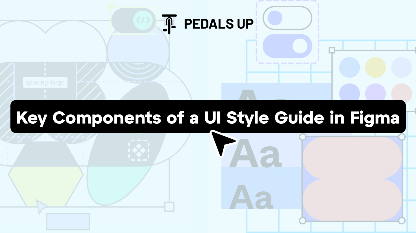
Here’s what a solid UI style guide must include:
1. Color System
- Primary, secondary, and accent colors
- Grayscale palette
- Status indicators (success, warning, error)
Example: Shopify’s Polaris system employs specific naming such as primary-blue-500 and grey-100 with good color usage documentation.
2. Typography Scale
- Font families
- Font weights (regular, medium, bold)
- Size and line-height tokens
- Usage guidelines (e.g., Heading 1 for titles, Body for paragraphs)
3. Spacing System
- Define increments (4px, 8px, 16px, etc.)
- Set up Figma spacing tokens
- Use auto layout with spacing components for consistency
4. Components and Variants
- Buttons, inputs, cards, modals, dropdowns
- Use Figma variants to manage states (hover, disabled, active)
- Group in categories with clear naming (e.g., Button/Primary, Form/Input/With Icon)
5. Icons and Imagery
- Standardized icon set (Material, Feather, or custom?)
- Establish sizing rules and stroke consistency (e.g., all 24×24 with 2px stroke)
6. Grid and Layout System
- Establish a column grid (e.g., 12-column, 8px gutter)
- Mobile and desktop breakpoints
7. Accessibility Guidelines
- Color contrast ratios
- Minimum tappable areas
- Text readability
Example: GOV.UK Design System requires a 4.5:1 contrast ratio and 16px body text as a minimum baseline.
8. Tokens and Naming Conventions
- Establish naming such as –color-primary, –spacing-md, –font-body
- Optional: Utilize the Figma Tokens plugin for automating design tokens.
Step-by-Step: How to Create a UI Style Guide in Figma
Step 1: Begin a Focused Figma File
- Name it simply (e.g., Product UI Guide).
- Include a cover page with the brand name, last update, and usage directions.
Step 2: Construct a Color Styles Page
- Use Figma’s Style panel to define color styles.
- Group into folders: Brand, Grayscale, States, Backgrounds.
Step 3: Add Typography Styles
- Define and label text styles (e.g., Heading/H1, Body/Regular).
- Display them on mock text blocks to demonstrate hierarchy.
Step 4: Define Spacing Components
- Construct spacing blocks (e.g., 4px, 8px) as visible guides.
- Utilize auto-layout to apply spacing with ease.
Step 5: Construct UI Components with Variants
- Begin with buttons: primary, secondary, ghost, disabled.
- Add forms: input fields, checkboxes, radios, toggles.
- Use variants to manage size and state.
Step 6: Add Layout Grids and Breakpoints
- Set layout grids on frames.
- Determine breakpoint behavior (mobile-first or desktop-first?).
Step 7: Add Icon Set
- Import standard icons as components.
- Follow an icon/size/name naming convention.
Step 8: Document Interaction Guidelines
- Hover states, transitions, button behaviors.
- Utilize Figma’s prototyping tools to display interactions.
Step 9: Invite Team and Test the Guide
- Share with developers, QA, and designers.
- Request feedback and fill any gaps.
- Repeat according to the quality of supporting live work.
Case Study: Intercom's Design System in Figma
Intercom rebuilt their design system in Figma to enable quicker product releases across several teams. They:
- Built more than 150 component variants.
- Applied Figma Tokens to handle design variables.
- Merged their style guide with Storybook for developer handoff.
Outcome: They decreased design-developer misalignment by 40% and reduced their design QA cycle time by 60%.
Source: Intercom Design Blog
Tools That Help
- Figma Tokens Plugin: Streamline design tokens and keep developers on the same page.
- Content Reel: Pre-populate content in mockups.
- Design Lint: Identify discrepancies in components.
Why Pedals Up Is the Ideal Partner for UI Style Guide Creation

We’ve developed UI systems for high-growth startups and expanding SaaS brands alike—ones that actually get used. At Pedals Up, we assist teams in:
- Conducting audits of current design assets.
- Constructing reusable UI kits and component libraries in Figma.
- Syncing design and development workflows.
Creating a UI style guide in Figma isn’t busywork; it’s a multiplier. It speeds up every future design decision, makes your team’s output more consistent, and cuts developer confusion down to zero.
If your team is scaling and you’re tired of fixing inconsistencies after the fact—build the guide now.
Schedule a complimentary consultation with Pedals Up to review your existing UI or initiate your new Figma design system. Let’s organize your design mess.


