PedalsUp is built on clarity, movement, and confidence. Our brand identity reflects the same standard we bring to product, design, and engineering work: clean thinking, strong execution, and consistency that holds up across every touchpoint.
These guidelines exist to protect that consistency. From logo usage and color application to typography and brand presence, every element should feel intentional, recognisable, and unmistakably PedalsUp.
Brand
Resources
The Pedals Up Brand Guide serves as a central reference for maintaining a consistent and recognizable brand identity. It defines the visual elements, design principles, and communication standards that shape how the brand is presented across platforms.
Logo Type
The PedalsUp logo is the most recognisable expression of our brand. It combines the symbol and wordmark into one clear, balanced identity designed to work across digital, print, product, and presentation environments.
It is available in primary, black, and white versions to ensure clarity across different backgrounds and use cases. To maintain consistency, the logo should always appear in its approved form, with its original proportions, spacing, and color treatments preserved.
Primary Logo
Primary Logo
Black Logo
White Logo
Brand Colors
The PedalsUp color system is built around Orange, Black, and White — a palette chosen to feel bold, modern, and direct.
Orange is our primary brand color. It brings energy, visibility, and distinction. Black adds strength and contrast. White creates balance, clarity, and flexibility across digital and physical applications.
Used consistently, these colors create a brand presence that feels confident, clean, and immediately recognisable.
Orange
Our signature brand color. Used to create emphasis, energy, and brand recognition.
Hex
#F16621
RGB
241, 102, 33
HSL
20, 88, 54
CMYK
0, 57.68, 86.31, 5.49
Black
Used for depth, contrast, and a stronger visual foundation.
Hex
#060606
RGB
6, 6, 6
HSL
0, 0, 2
CMYK
0, 0, 0, 97.65
White
Used to create space, legibility, and balance across the system.
Hex
#FFFFFF
RGB
255, 255, 255
HSL
0, 0, 100
CMYK
0, 0, 0, 0
Logo Usage Guidelines
The PedalsUp logo should always appear in its approved form.
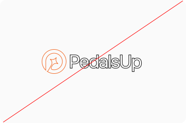
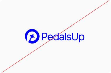
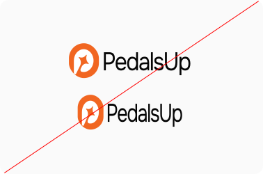
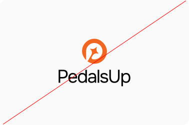
Do not stretch, rotate, distort, recolor, stack, crop, outline, or apply effects to the logo. It should never be treated as a decorative element or modified to fit a layout in ways that compromise recognition.
Strong brand systems depend on repetition and consistency. Every correct use of the logo strengthens recognition. Every incorrect use weakens it.
Don’t outline the logo symbol or wordmark
Don’t use colors outside of the brand palette.
Don’t change the logo's ratio arbitrarily
Don’t stack the logo elements.
Do not apply gradients to the logo.
Do not use the logo as an image frame.
The
Brand Mark
The PedalsUp brand mark is the symbol-only version of our identity. It can be used where the full logo is not necessary, such as favicons, app icons, social avatars, compact placements, and brand accents.
Even when used independently, the brand mark should retain its original proportions, approved color treatments, and visual clarity. It should never be altered or used in ways that reduce recognition.
The Wordmark
The PedalsUp wordmark is the typographic expression of our brand name. It can be used independently when the symbol is not required or when a cleaner typographic presence is more appropriate.
The wordmark should always retain its original type treatment, spacing, alignment, and approved color variations. It should not be recreated, retyped, or modified.
Usable Logo Color Combinations
The PedalsUp logo is available in a defined set of approved color combinations to ensure visibility, contrast, and consistency across different backgrounds.
Use only the combinations shown in this guide for light, dark, and brand-colored surfaces. Unapproved color versions should never be introduced, even when adapting the logo for campaigns, presentations, or partner materials.
Consistency across environments is what makes the identity feel reliable and strong.
Our Typeface
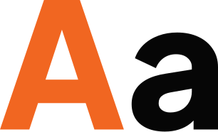
Plus Jakarta Sans is the primary typeface of the PedalsUp brand.
It was chosen for its clean structure, modern personality, and strong readability across interfaces, marketing materials, and brand communications. Its flexibility across different weights allows the type system to feel cohesive whether it is used in headlines, body copy, UI elements, or presentation decks.
Typography at PedalsUp should always feel clear, modern, and purposeful — never decorative for the sake of it.
Plus Jakarta Sans
Regular
Medium
Semibold
Bold
ABCDEFGHIJKLMNOPQRSTUVWXYZ
ABCDEFGHIJKLMNOPQRSTUVWXYZ
123456789@#$%^&
Question you might have,
Answers we definitely got
How big is the PedalsUp team?
80+ engineers, designers, and AI specialists working across Ahmedabad, Dubai, and Singapore.
Where are you located?
Ahmedabad (India), Dubai (UAE), and Singapore. We serve clients across the US, UAE, and Australia.
How long has PedalsUp been around?
Since 2018. In that time we’ve delivered 200+ products for 60+ clients.
Do you work with startups, or only larger companies?
Both.
Are you hiring?
Yes. Open roles are listed here.
How do I start a conversation with PedalsUp?
Book a call or tell us about your project. We respond within 1 business day.
It’s your time to grow
Your next move starts here.
Build with confidence.
Great brands are not built through visuals alone. They are built through consistency, clarity, and the standards behind every decision.
PedalsUp brings that same mindset to every product, platform, and partnership we work on. If you are building something ambitious, work with a team that values strong systems as much as strong ideas.