
Table of contents
7 Design System Examples Product Teams Can Learn From in 2026
The best design system examples do more than show you what buttons, forms, and navigation should look like. They show how experienced product teams make recurring design and engineering decisions once, document them, and reuse them as the product grows.
That is the useful part to study.
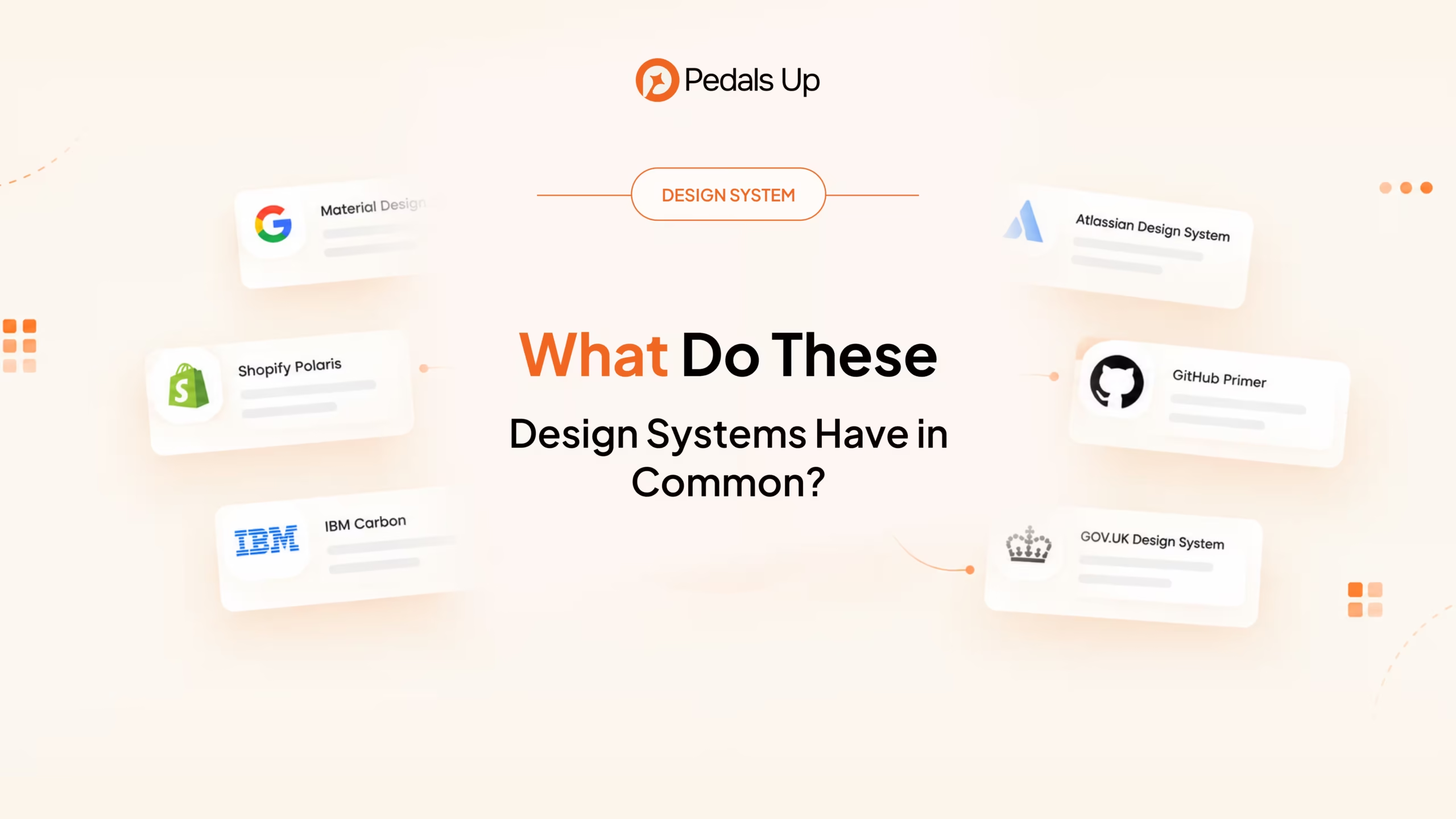
For this list, we looked at seven established systems that solve different problems: Google Material Design 3, Shopify Polaris, IBM Carbon, Atlassian Design System, GitHub Primer, GOV.UK Design System, and Microsoft Fluent 2.
If you think that your product is reaching the point where Figma and production are drifting apart. Teams are rebuilding similar components, or familiar workflows behave differently across screens, these systems offer practical lessons.
What Is a Design System?
A design system is a shared set of foundations, design tokens, components, patterns, documentation, and implementation rules used to build consistent digital products.
A UI kit gives you reusable interface elements. A design system also establishes how those elements should behave, when they should be used, how they work together, and how they translate into production.
Here are seven worth studying, and more importantly, what each one can teach a growing product team.
1. Material Design 3: Structure the Decisions Behind the UI
Material Design 3 is probably the most familiar system on this list, but copying its visual style is not the interesting part.
What is worth studying is how Material turns design decisions into reusable rules. Its approach uses semantic roles and tokens for properties such as color, typography, and shape. A token describes the purpose of a value rather than leaving teams to work with isolated visual values.
That becomes useful when a product needs to support themes, multiple platforms, or a growing number of components.
Useful when: Your product has accumulated inconsistent visual decisions, and you need stronger foundations before adding more components.
2. Shopify Polaris: Design Around the Work Users Do
Shopify Polaris is particularly relevant for SaaS and operational products.
Shopify Admin has to support merchants doing real work: entering information, managing resources, navigating records, and triggering actions. Polaris provides components around those needs, including forms, navigation, data display, and actions.
That is an important distinction. A useful design system should not grow because somebody wants another component in the library. It should grow around recurring product needs.
For a B2B SaaS product, those needs might be approvals, permissions, account configuration, filtering, reporting, or onboarding.
Useful when: Different parts of your product support similar workflows but solve them differently.
3. IBM Carbon: Move From Components to Patterns
IBM Carbon Design System is worth studying once your component library is no longer the main problem.
Carbon explicitly separates components from patterns. Components are reusable UI building blocks. Patterns combine components, templates, flows, and sequences to help users accomplish a goal.
Consider filtering. A search field, dropdown, and button can all be perfectly standardized while different teams still create completely different filtering experiences.
That is where patterns become valuable. They establish how several components should behave together in situations the product encounters repeatedly.
Useful when: Your buttons and inputs are consistent, but the workflows built from them are not.
4. Atlassian Design System: Make Tokens a Shared Language
The Atlassian Design System is a strong reference for teams trying to manage design decisions across a large product ecosystem.
Atlassian describes its design tokens as the single source of truth for naming and storing design decisions. Its token guidance focuses on semantic meaning rather than choosing a token simply because its current value happens to look right.
That distinction matters when themes or product foundations change. A value chosen because it happens to be blue today can break when the same interface needs to work in another theme. A semantic token carries the reason the value exists.
Atlassian also connects its foundations, components, tokens, and styles to Figma libraries used by product teams.
Useful when: Several teams or products need to share the same design language without hard-coding the same visual values everywhere.
5. GitHub Primer: Decide What Belongs in the System
GitHub Primer provides a lesson that smaller design systems often overlook: not every component created by a product team should immediately become part of the central system.
GitHub documents an explicit path for new components. A component can begin inside a feature team, gain usage, and eventually be upstreamed into Primer when it is mature enough to be useful more broadly. Components then move through maturity levels before reaching stable status.
Primer also connects its Figma components with developer implementations and design tokens, giving design and engineering teams a shared reference.
This is design-system governance in practical terms: reuse should be earned by repeated product need.
Useful when: Your design system is growing, and you need rules for deciding what becomes shared, what stays product-specific, and who owns it.
6. GOV.UK Design System: Build Accessibility Into the Default
The GOV.UK Design System is one of the strongest examples of accessibility being treated as part of the system rather than a final review step.
Its accessibility strategy applies accessibility principles to styles, components, and patterns, while its published Design System and Frontend documentation sites report WCAG 2.2 AA compliance.
There is another useful lesson here: components and patterns are backed by research. GOV.UK publishes information about how and when designs have been tested, and proposed additions go through research, accessibility testing, and review before entering the system.
That makes accessibility and evidence part of the system’s operating model.
Useful when: You want accessibility and tested interaction behaviour to become defaults teams inherit rather than requirements they repeatedly rediscover.
7. Microsoft Fluent 2: Keep Design and Code Connected
A design system can look excellent in Figma and still fail in production.
Microsoft Fluent 2 is worth studying because the relationship between design assets and implementation is explicit. Microsoft describes its core UI kits as code-aligned building blocks, with properties in Figma mapping to code and variables covering areas such as color, spacing, size, stroke width, and corner radius.
Fluent also provides implementation libraries across React, Web Components, iOS, Android, and Windows.
For product teams, the lesson is straightforward: the design library and production component library cannot evolve as separate systems indefinitely.
Useful when: Figma and production are gradually becoming two different versions of the same product.
What Do These Design Systems Have in Common?
The seven systems solve different problems, but they reveal a useful progression:
Foundations → Tokens → Components → Patterns → Code → Documentation → Governance
Material demonstrates strong foundations. Polaris shows how components support product work. Carbon moves into reusable patterns. Atlassian shows how tokens can carry decisions across a product ecosystem. Primer demonstrates governance. GOV.UK brings research and accessibility into the system. Fluent connects design assets with implementation.
You do not need to reproduce any one of these systems.
A growing SaaS product with two frontend engineers does not need the governance model of GitHub or the cross-platform scope of Microsoft. Building that much infrastructure too early can create more work than it removes.
The better question is which problem your team has reached.
When Does Your Product Need a Design System?
A small product does not automatically need a formal design system.
The case becomes stronger when inconsistency starts creating operational cost. Designers recreate components that already exist. Engineers maintain multiple implementations of the same interaction. Figma no longer reflects production. Accessibility issues recur. New features take longer because basic interface decisions keep getting reopened.
A useful test is:
Are we repeatedly solving interface problems we have already solved?
If the answer is yes, start systematizing those decisions.
That may initially mean typography, spacing, colors, buttons, forms, and a few recurring workflows. The system can become more sophisticated as the product and team demand it.
Frequently Asked Questions
Which design system is best to learn from?
There is no single best design system for every product. Material Design 3 is useful for foundations and tokens, Carbon for patterns, Atlassian for scaling design decisions, Primer for governance, GOV.UK for accessibility, Polaris for SaaS workflows, and Fluent 2 for design-to-code alignment.
What should a good design system include?
A mature design system usually includes foundations, design tokens, reusable components, interaction patterns, accessibility guidance, documentation, production implementation, and governance. Smaller teams can start with the parts they repeatedly need rather than building the entire structure at once.
Should a startup build its own design system?
Not necessarily. Early products can often work with a smaller component library and a few documented foundations. A more formal system becomes valuable when repeated UI decisions, multiple contributors, inconsistent workflows, or design-to-code drift begin slowing the team down.
Build the System Your Product Actually Needs
The useful part of studying established design systems is not deciding which one to copy.
It is seeing how different teams solved problems that appear as products scale: inconsistent foundations, repeated workflows, accessibility, design-to-code drift, component ownership, and governance.
Your product may only have one or two of those problems today. Start there.
PedalsUp works across product design and engineering to create product UX, UI systems, reusable components, and production-ready digital products. If your team is spending more time maintaining interface inconsistencies than improving the product, it may be time to formalize the system behind it.